2016, 5SD037

Big Game Blog 7

Environment Art and Scene Building Funtimes

So constructing the final scene took a while. Considering how much iterations i had to go through for different pieces and the different prototypes i had to set up to try to get the visuals to work with the level design with all its different demands and  different lighting conditions (we have a few of those). Like for example how some parts of the level had to be outdoor, and some had to be indoors. This wasn’t necessarily planned from the start, but rather something we found we liked to do some week into the project. Oh and also because it is a fairly long level. Actually, its stretches for almost 1 kilometer in the X axis.

enviro1


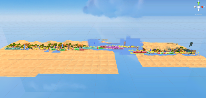
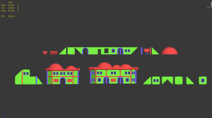
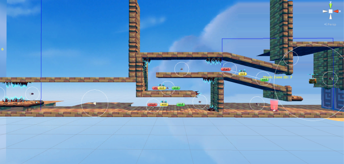
So to showcase slightly better what my contribution to this actually involves, lets have a look at what i receive from my level designer. So we split the level up into 5 separate pieces, each pieces where then to be connected to one-another and hooked up. So lets use one outdoor piece as an example. So this is what the designer typically brought me:

enviro2

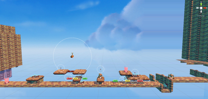
And this is how it looks when i am done with it:

enviro3

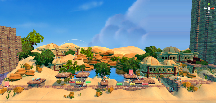
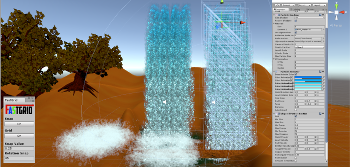
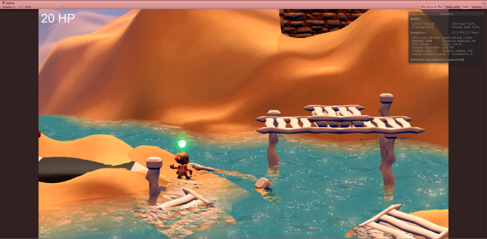
And here are some screens of how it would could look in-game with the game camera and some minor filter effects:

Here’s just one more example of the indoor environment as well. Because of time limits i had to re-use a lot of assets that (may or may not) be really intended to act as indoor asset. But you kinda do what you have to i suppose. So here’s just the foundation level design:

enviro6

And here’s how it looks when iv’e added the environment and lighting.

enviro7

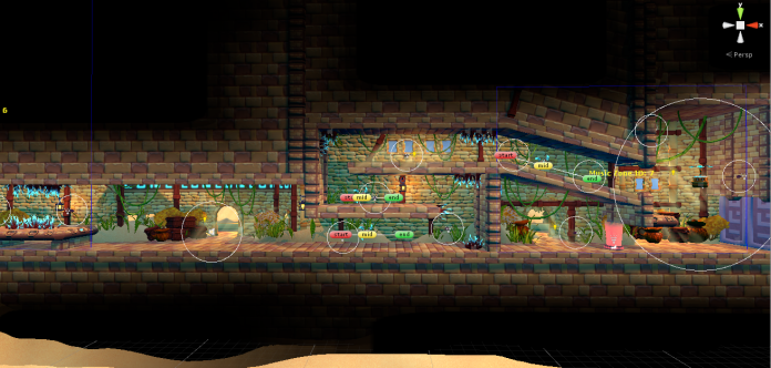
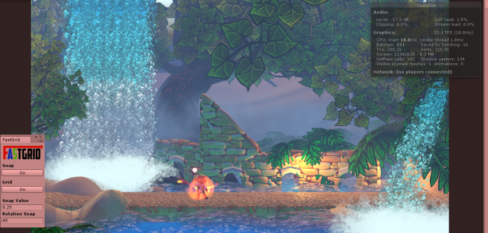
And here is how it would look in-game.

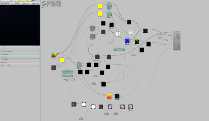
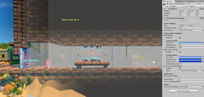
The interesting part here is using a environmental lighting script (similar to a post effect box) to dynamically alter the lighting from the outdoor environment. Basically it is a script that works with world position boundary’s and a fade transition zone. Then we collect the Unity lighting settings in the script, (and some directional light templates) and cross fade them to create new lighting templates for specific regions of the level. Fun stuff! You could even access some camera effects like this, for example a LUT map filter for some really fancy stuff, but it turned out to be slightly more complex so we saved that for another time. Credits to Jens for setting up the script real nice.

enviro10

And thats that.


Standard
2016, 5SD037

Big Game Blog 6

Water Particle Funtimes

So i made some water particles for the game.

particle1

So the waterfall consist of a main particle and a adjustable submitter for collision. To save performance (not necessary really, but hey why not…) i just manually placed all the watersmoke. Actually using the legacy particle system for these water effects because i used some preexisting settings that i found. The plan was to re-integrate it into the shuriken system, but like with so many other things, i kinda ran out of time. Will remake this properly in the future.

Same principle here really, just different setting. Used to create a water canon effect which later turner into what you see on the right. The water pipe tube made by Emma.

I later just used the same particle to also create collision effects when the player interacted with the water.

Here are the particles created with some custom PS brushes and then alpha’d to make them usable as a particle:

And here one of the first outdoor test scene i used to test the water to see if it integrated with other assets and how it functioned in different lighting conditions. No the final lighting used here, made a lot of changes following this screen.

particle10

And thats that.

Standard
2016, 5SD037

Big Game Blog 5

Speedy Trees Funtimes

So i made some tree models for the game. There’s alot of cool things speedtree can offer you. One of the biggest selling points for us was the modeling time it saved. Additionally the wind feature incorporated into Unity’s wind zone system made it a real gem that saved us the time of creating custom shaders using vertex color animation. A real nice time saver to say the least. Models and alphas setups by me. Game ready textures by Emma.

And thats that.

Standard
2016, 5SD037

Big Game Blog 4

Modular Fun Times

So i made some modular house pieces that i assembled into the clunky house thingy you see in the background. All the pieces share 3 different texture atlases and can also be exported as separate pieces and use individually inside the engine,  which i took advantage of quiet a lot. I really wanted to work on this some more and make a better collection of assets that could be assembled into better and slightly bigger modular pieces to ease level building, however time kinda ran out so i  had to stick with this

Most textures not by me.

modular7

Some ground pieces i did. Textures by me.

Ramps and Z walls. Textures by me

Wooden Pieces. Textures not by me

And thats that.

Standard
2016, 5SD037

Big Game Blog 3

Water Funtimes

Been fixing up a completely new custom shader for our ingame water. Had alot fo fun with this, but it sure took a long time. I still want to fiddle around with it some more, im not completely happy with the surface refraction and the edge foam at the moment. But it will have to be postponed slightly since i’ve got some other things to take care of this week.

Here is a Screen:

Unity 2016-04-25 22-14-22-27

Here’s a video link to see the wave movement in action

And here is the SF nodetree

Untitled-1

And that’s that.

Standard
2016, 5SD037

Big Game Blog 2

Shader Funtimes

So for this week i have been doing a lot of different things. But some of the most interesting was to create some custom shaders. This is not any final stuff, and i still have some figuring out to do in order to make use of the efficiently. But anyways, here are some refraction shader variations i created using shaderforge:

Watch below! (if you can bear the horrible gif. quality)

Possible water refractions
//giphy.com/embed/aDwGuCJyBnocw
Working on some possible projectile effects
//giphy.com/embed/moh3eAoYAL5aU


Standard
2016, 5SD037

Big Game Blog 1

Preparing the main character – Neiva

So its time for some mandatory blogging for Big Game project. So for eight (or something) weeks i am going to be updating here about some of the stuff i am working on. So for this week: skinning and rigging preparation!

So we got ourselves a main character called Neiva. And Neiva is supposed to jump and run around and behave in your typical animated fashion. So to do this we need a rigged and skinned character that can be passed down to our animator. So i actually started doing this prior to the course start, but i am going to show some images of this anyways.

So here are some very “rough” screens of the rig i did. There are also some screens showcasing different problematic areas i struggled around with. Most of these wont be terribly visible in the game anyways, so i have put them aside for now. I might return and do some updates when we start to polish our animations, especially when we go over our cloth animations. But for now this will have to do.


Standard
2015, 5SD033

Space Shooter Project. Blog 6. Level Logistics

So for this blogpost I am going to go through some logistical solutions regarding our level design. We have so far had a few problems in structuring our level. This is mainly due to the fact that we lack a proper tilemap. Hence we are placing interactive objects through hard coding. This makes moving objects around and testing different level structures very tedious. In addition to this we have certain graphical aspects of our level which needs to correspond with the positions of said interactive objects. The problem which arises from this is that since we don’t have a tilemap, all the graphics are composed of large imagery. So when objects move, the large image which makes up the level, needs to be changed quite comprehensively. The main example of this is vegetables, which we use to award the player score. Since they are located in dirt covered areas while the rest of the map is grassy, every time you move or change a vegetable cluster, the map needs to be altered.

So the solution for this is to make a map blueprint which is accessible and easy to use for graphics and programming. So this was the quick fix for this issue:

Vegetables position


This image is 1300x1300px which the exact size of our level is. The image is then divided into squares of 42x42px. This is because our vegetable has a size of 32x32px with an offset of 10px which makes a vegetable size 42×42. Then all vegetables which are going to be positioned on the map are drawn in as squares with a key number ranging from 1 to 4. Each number representing a specific vegetable type. The only vegetable which is bigger than 42x42px is our winning condition (the prized melon) type vegetable. There is also a starting positions for the Mole (player avatar) and for the Gardener (the key patrolling enemy). So this is basically a graphical replacement for how a code tile map would (sort of) work.

The benefits of this is that you can use this image without an alpha channel background as a frame for drawing on. Which means graphically, all you need to do is draw in the vegetable parts exactly where this image has the vegetables positioned. For programmers it is easy to make a TXT file with row positions which is going to ensure that the position of each vegetable ends up at the exact correct spot. So each score cluster has a little number underneath it to separate them from each other. A text file example of how to explain the positioning of cluster number 1 looks like this:


1 – tomato

2 – strawberry

3 – eggplant

4 – melon

Example for rows:

1,(4)             x, y, – y

plant type, (amount) x, y position, – row direction

SHEET:

cluster 1

1(4) 126, 42 – x

2(4) 126, 84 – x

2(4) 126, 126 – x

1(4) 126, 168 – x


So as a programmer you simply take the x and y coordinates and position said vegetable type the amount of times listed in the bracket along the said axis, in this case the X axis.

Blueprints for positioning of interactive objects in the underground exist as well, albeit not as crucial as the surface one. This for the simple reason that the graphics don’t need to correspond with the objects positions in the same way.

That is all.

Standard
Okategoriserade

Space Shooter Project. Blog 5. GUI

So this week I have been working on the overall GUI for our game Mole Munch. This includes all the different menus and screens as well as the final HUD for the game. It has been a bit more work than I expected, probably because I made it slightly more extensive than it would actually have to be. Just as a quick example I made a level select screen because we planned some additional smaller levels as well as a small tutorial which we will probably end up ditching because of time constraints. So I am going to be showing some picture and coordinates which I gave to my programmers in order for them to be able set this up in the game.

So this is the menu design for the startup screen (note that it is not me that has done the background image):

Menu_1920x1080_2

And here is another of what our manual page looks like with some simple control instructions. I might add some additional pictures and text to this screen to give out some more information:

Menu_Manual

But all images and text are separated in different layers in Photoshop in order to be able to properly set up sprite sheets with all the different items. I seriously recommend (for other graphic people like me) to set up actions for saving out png Images, not only for full images but for folders/layers as well. This will save you an enormous amount of time and pointless clicking on “save as” and other mumbo jumbo.

jhjhvf

Here is a nice page describing how to set up a very efficient way of saving selected layers/folders as png files with a single click: http://viget.com/inspire/single-click-layer-exporting-in-photoshop

So back on track. This is the empty screen I sent off to the programmer to use as a base:

Menu_empty

And this is the sprite sheet I created alongside with it to set up all the different menus.

UI_Menu_Spritesheet

My programmers wanted it set up in this manner with all new items starting on 0 on the X axis and then animations accompanying to the right. So since a lot of items where different sizes I needed to make some explanations. So I made a txt file that explains the size of every sprite and its location. To get the green “select” version of the panels you simply add the width of the sprite to the X axis:

EX:

1 “Artifact” x, y, width, height

SHEET:

1 play  0, 0, 393, 185

2 manual  0, 185, 283, 149

3 credits  0, 334, 283, 149

4 quit  0, 483, 283, 149

5 tutorial  0, 632, 283, 149

6 level1  0, 781, 283, 149

7 level2  0, 930, 283, 149

8 main menu  0, 1079, 333, 84

9 level selection  0, 1163, 333, 84

10 manual  0, 1247, 333, 84

11 credits 0, 1331, 333, 84

12 board empty  0, 1415, 904, 781

13 board controls  0, 2196, 904, 781

14 back  0, 2977, 233, 128

I have never really set up a lot of sprite sheets before so it took me some trying around to get a nice workflow going. So the first one took quite some time, but after that was done I was able to produce them at a significantly higher speed.

So I did some work on the HUD as well. This is what I wanted the HUD to look like:

Hdufinal

And this is what I could send so the programmers to use as a frames image for that game.

hurhuhrur GUIDLINES

Everything else was saved into sprite sheets similar to the one I showed before (with proper documentation). In addition to this I also used the sprites in the HUD together with grids in order to get coordinates to every items position. Like this:

pijpjp

By doing this I could send an additional txt file to the programmers which would make it easy for them to import all the different sprites at the correct position and with the correct spacing. It looked something like this:

EX:

Sprite x, y,

:

Speed Powerup: 40, 1006

Vision Powerup: 295, 1006

Rocks(2x): 658, 1000. spacing: 85px

Melons(6x): 965, 1000. spacing: 64 px

modifier: 1478, 1010

score: 1705, 1010


So that’s some of my work this week. Hopefully this wasn’t to gruesome to get through as a reader.

Standard
2015, 5SD033

Space Shooter Project. Blog 4. Eagle Animation

So for this week I am going to go through a movement animation for one of our game enemies – The Eagle. It is not one of the higher priority animations for our game however which is why its creation has been delayed quite a bit. It is also not entirely completed yet, but an atlas has been made so the programmers have something to use and try the basic animation with. So a short summary of what part the eagle play in the game:

The eagle patrols the map in a set pattern. The entirety of the eagle is not visible to the player though. The only thing the player will see is a shadow floating on the ground. This is to give the impression of the eagle being high up in the air, scouting for pray. If the player collide with the shadow, a screeching sound will be heard and he/she will only have a short time to escape underground. Should the player remain on the surface, the eagle will swoop from the border of the screen and catch you, which is what the animation is for. Because the animation will only really play once you get caught, the completion priority has been pretty low.

Eagle_Atlas

Above is the first draft for the eagle atlas. At the top you see the shadow which will be floating around on the map. Second down is simply the original sprite, it is not entirely necessary to involve since the frame is in the animation as well. It is more a matter of emphasizing which frame to use for the eagle to move without any animation to it. Third down is what is supposed to (eventually) be the flyby grab animation.

So style wise it is pretty straight forward and follows the art guidelines for a game. This includes a black outline, primary colors, a highlight on the primary color, and a shadow. It is supposed to depict a bald eagle. The reason for choosing just the bald eagle is because of its rather unique appearance with the white head and tail feathers. Additionally it is one of the more well-known eagle families and my hope is that it will help to understand the connection towards a predator bird and thus an enemy of the player. This despite the bird not really being shown for a majority of the gameplay. The shadow outline is more important and I tried to make the feathers look a bit edgy but not entirely sure whether it succeeded or not. My personal opinion is that the shadow could probably be emphasized a lot more to tell the player that it is an enemy.

output_BTukhA

As far as the animation goes I am not entirely happy with it. It is however, missing quiet some frames that is going to make it feel more complete. Some things that I plan to do is make the wing movement a lot more radiant and noticeable since it is rather stiff and uninteresting at the moment. Additionally I will need to add some frames where the bird shrinks in size to tell that it is descending down towards the ground.

It did present a bit of a challenge for me to do this animation for various reasons. I have never really animated anything before so this fact slowed me down a little. The top down perspective also presents some difficulties, mostly in how to make things look interesting and believable at the same time. Also the nature of this particular animation in the sense that it starts out as a shadow, then spawns outside the screen and swoop in, and it has to look like its coming from a higher altitude. So I’ll wait and see how this first early version look and feel in the game and then make adjustments accordingly.

Standard